Q-Flex supplies components to the electronics industry. The identity renewal set out to express the company’s focus on quality, flexibility and expertise, alongside its commitment to responsible business and continuous improvement.
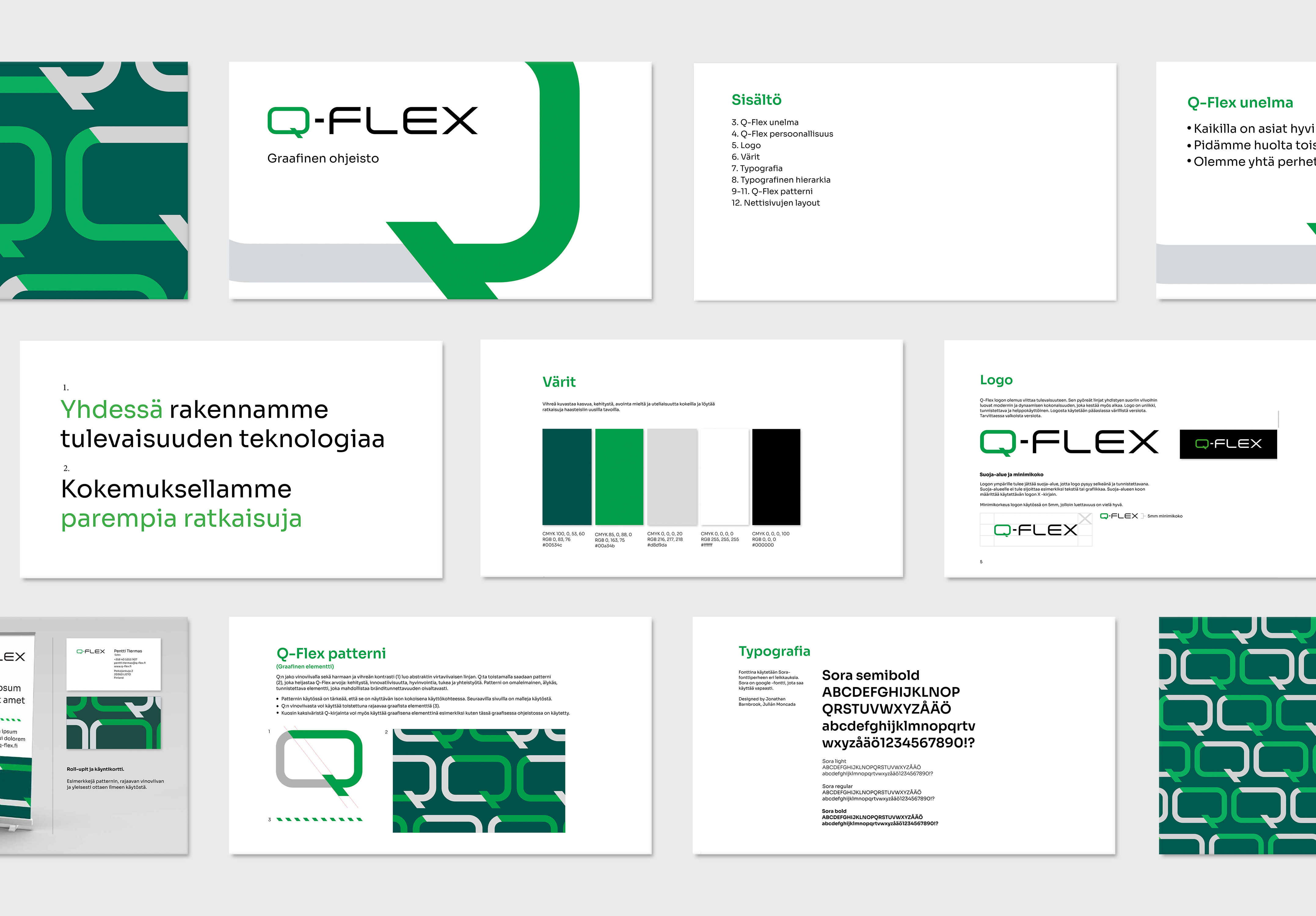
The visual identity includes a logo, colour palette and graphic pattern inspired by circuit board structures. This shared geometric language connects the identity to Q-Flex’s technical field and provides a flexible system for different applications.
The project also included brand guidelines and an image library, supported by a planned and art-directed photoshoot. The identity was applied across a new website, an exhibition stand and marketing materials.